Motus Forma.
7 directions
A new website for a physio practice, built round by round, with every decision written down.
- Client
-
Motus Forma Physiotherapy
From 8 November 2026, in progress
- What I did
-
- Research.
- Strategy.
- Art direction.
- UX.
- Build.
- SEO.
- Result
-
In testing, the latest pages score 100 for performance on a phone.
It had a strong brand, and a website that didn’t match it.
Motus Forma is a physiotherapy practice in Hurlstone Park, founded by Sebastian Hardy, for runners, cyclists, swimmers and anyone who wants to keep moving.
In Google’s speed test for phones, the website scored 48 out of 100, and its main image took 18.6 seconds to appear.
Research first, then three directions to choose from.
Before designing anything, I studied about 35 of the best clinic and sport websites, ten practices nearby and across Sydney, what people search for, his credentials and the rules for health advertising.
Then I showed him three directions, with no recommendation, so the choice was his.
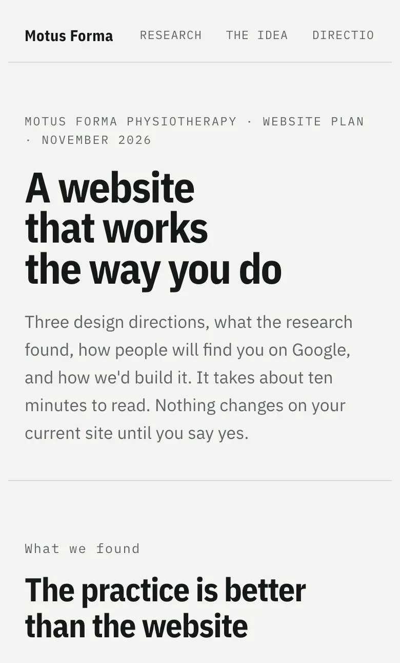
Round 1: three directions, each one working on a phone.
-
 A · Telemetry His pick
-
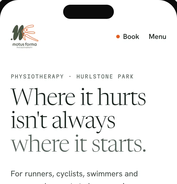 B · Form Study
-
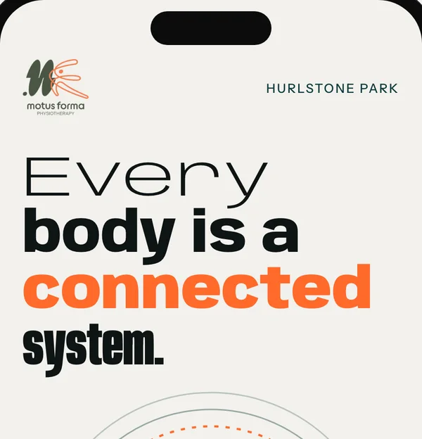 C · Connected
“Really like first option. Would like it to be more my colours and fonts. Feels a bit disconnected from the logo and existing branding. But the layout is mint.”
Then three versions of the first, in his colours, fonts and logo.
They were competent, but too predictable. So I went back to the art direction.
- Signal
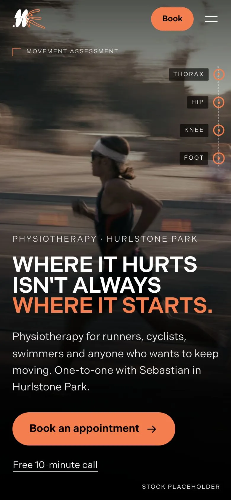
- Balance
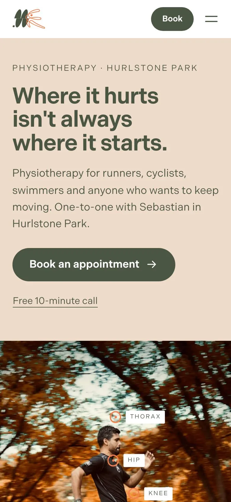
- Form Line
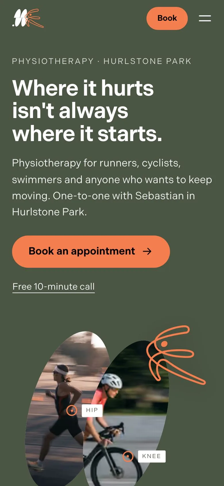
Round 2: four directions, each on its own board.
The idea, the type, the colours and the photography, with a first look on a desktop and a phone.
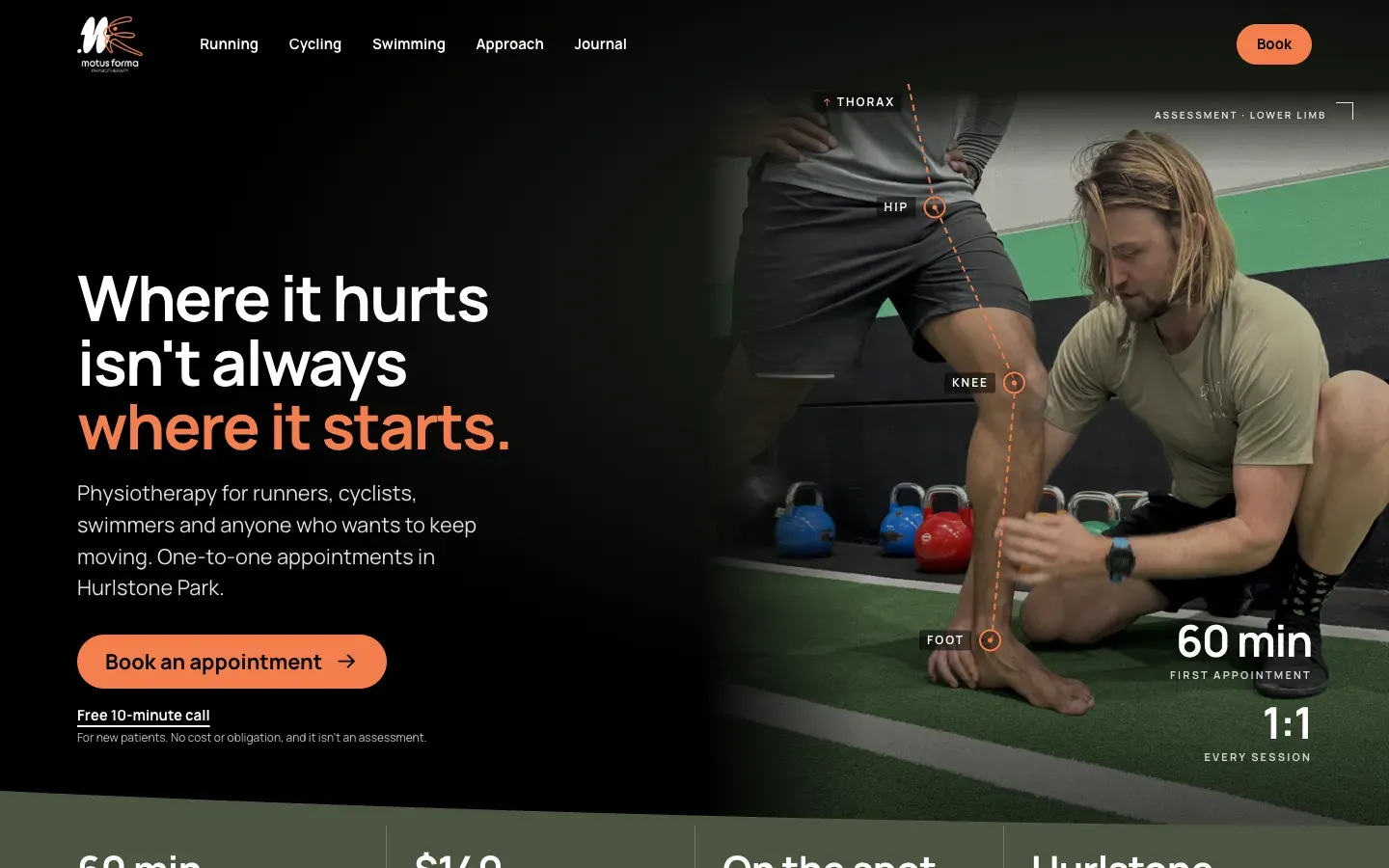
The first kept the direction he picked in Round 1, refined to his brand, and I built the homepage on it.
- 01 · Option A refined
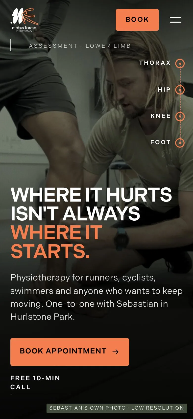
- 02 · Editorial Performance
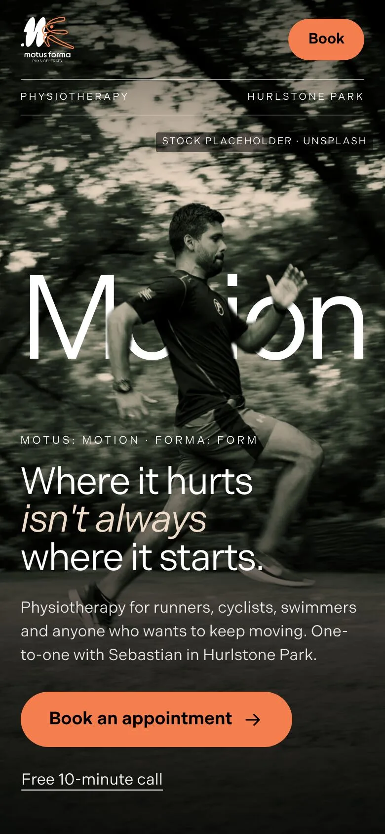
- 03 · Movement in Motion
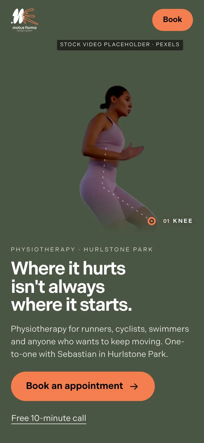
- 04 · Contemporary Clinical
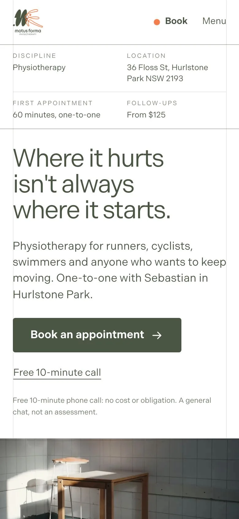
“I love it! It looks great.”
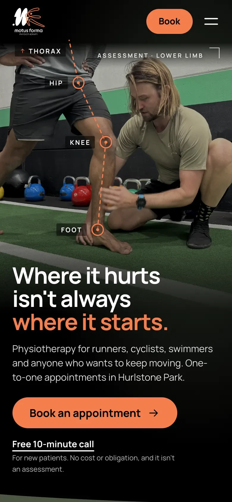
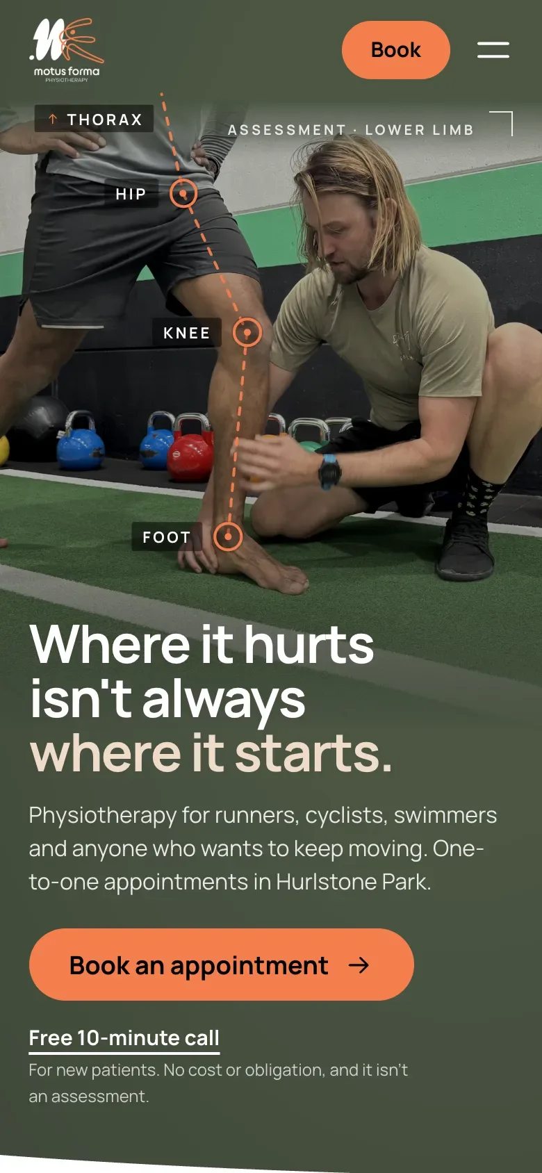
He asked how it would look without the black.
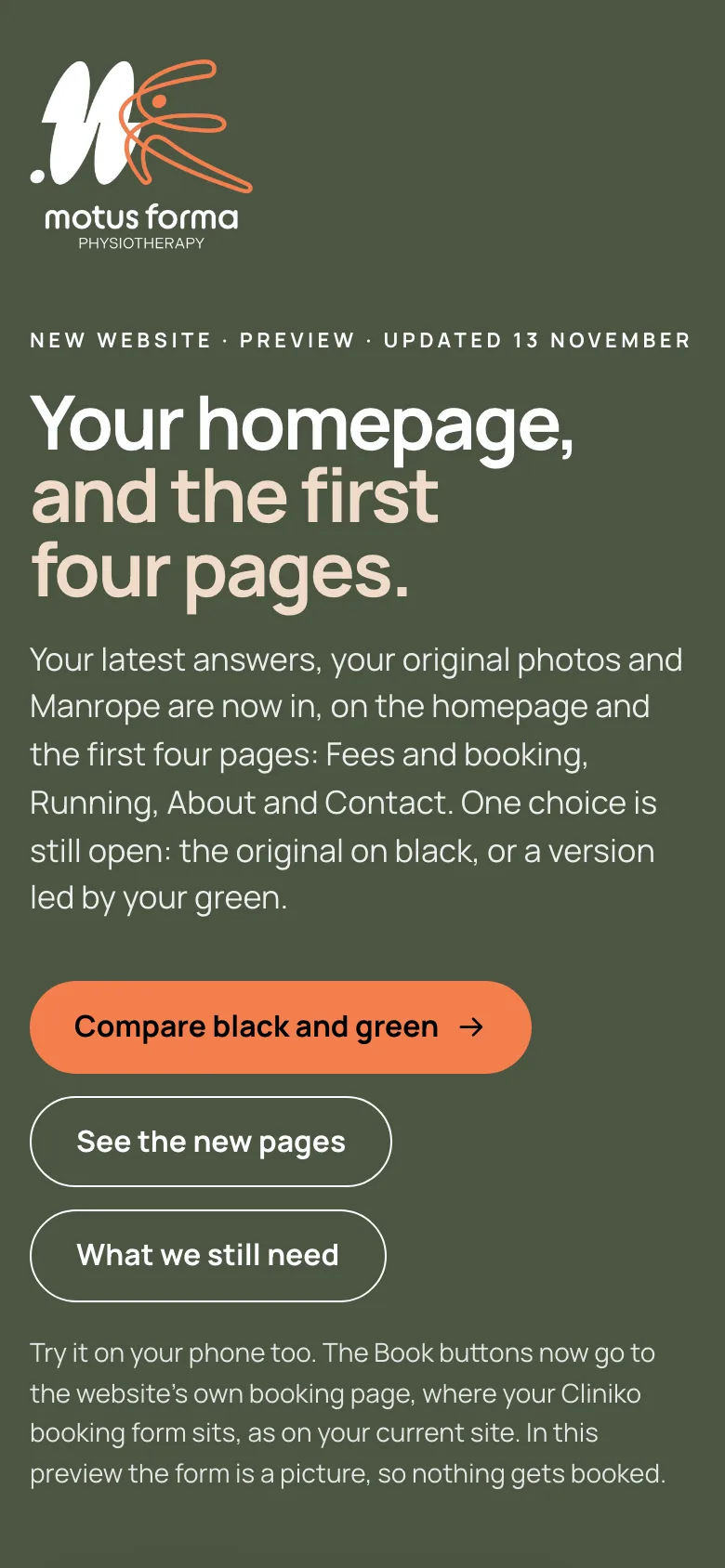
So he got both, side by side, each with its case.
Black “The strongest contrast, so the photo and the orange stand out most.”
Green “Green leads, as it does in your logo.”
Five free fonts, on his own homepage. He chose Manrope.
His brand font needs a paid licence to be used on a website. Manrope is free, for the website and anything else he designs.
 DM Sans
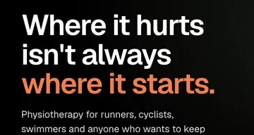 Geist
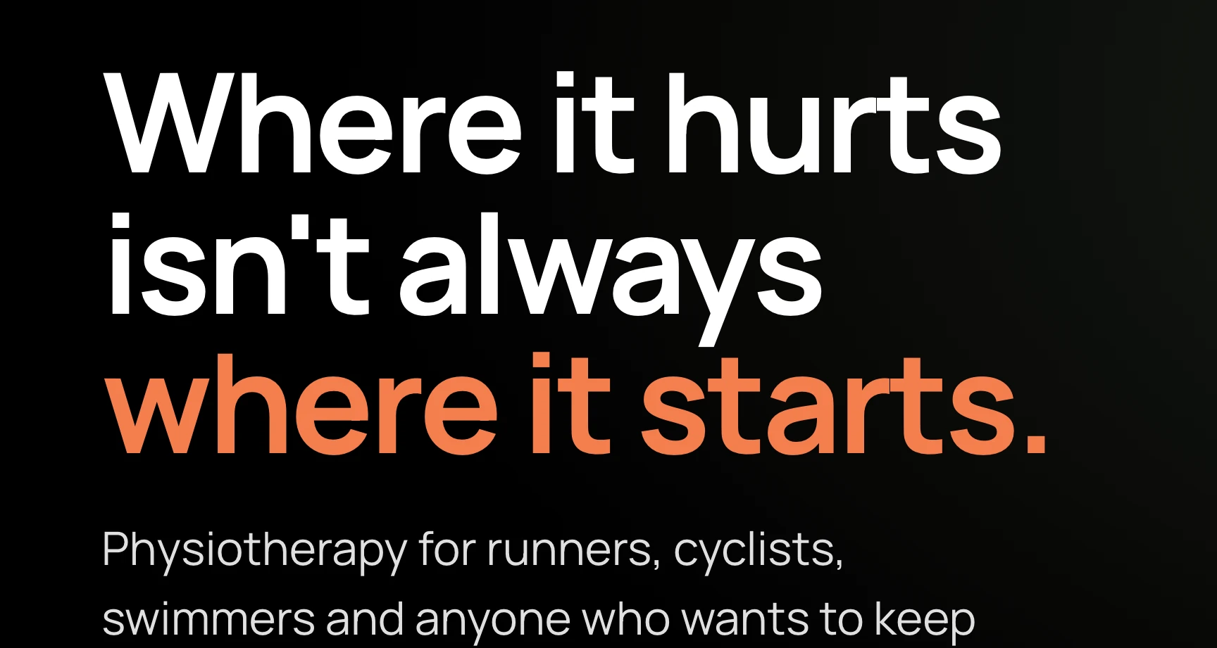 Manrope His choice
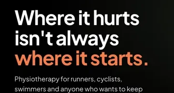 Plus Jakarta Sans
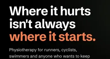 Schibsted Grotesk
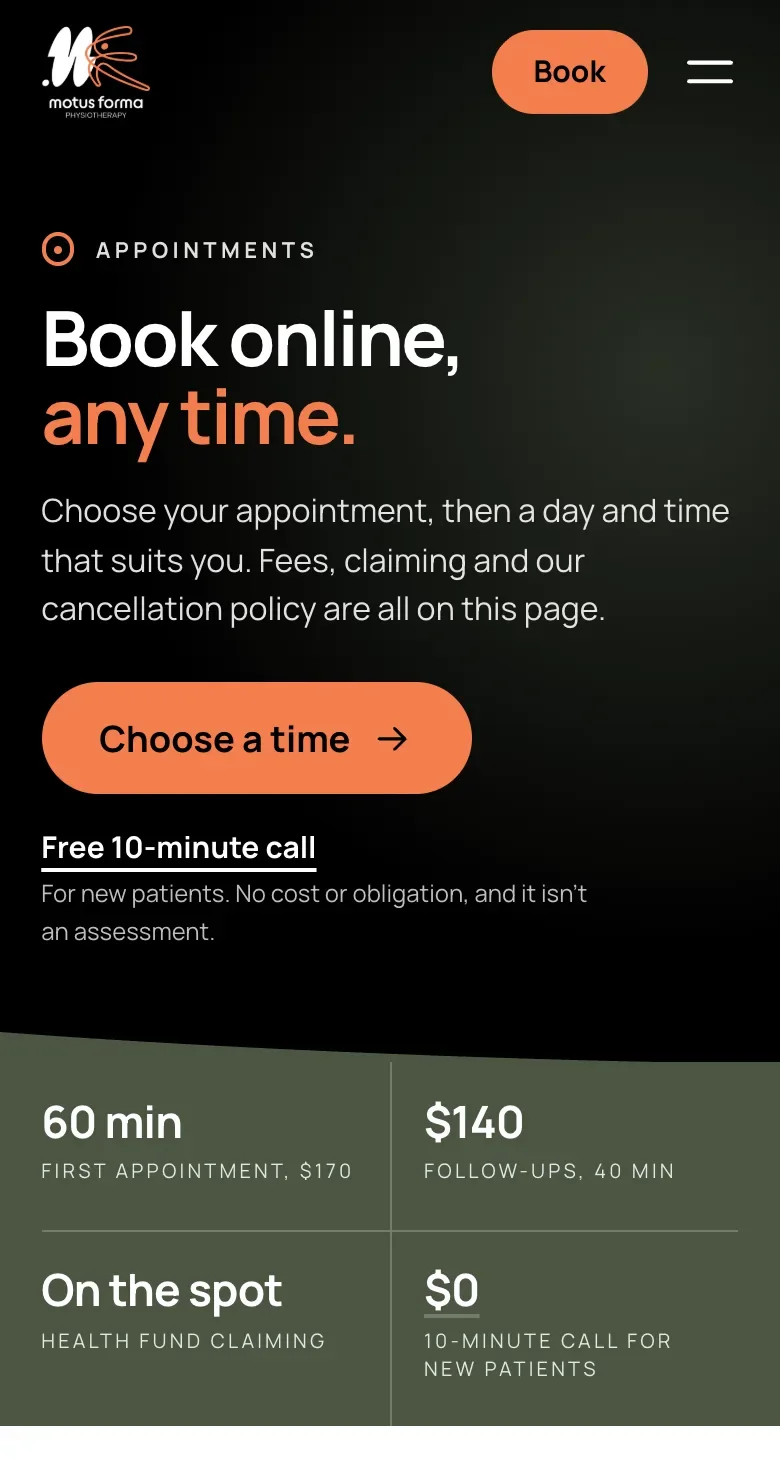
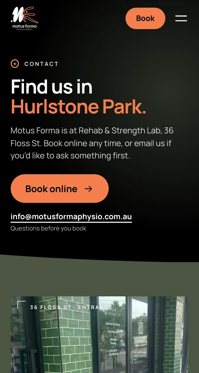
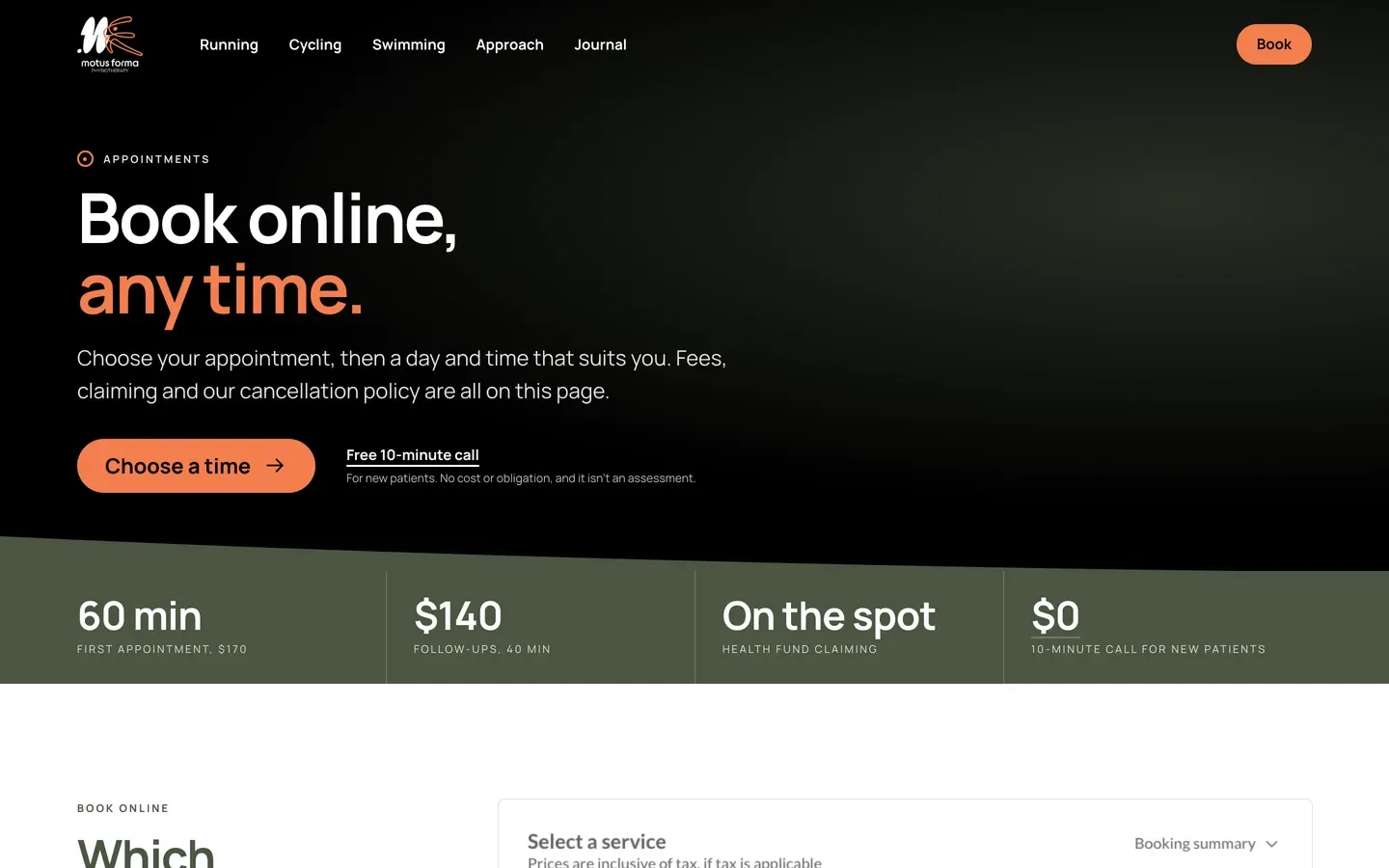
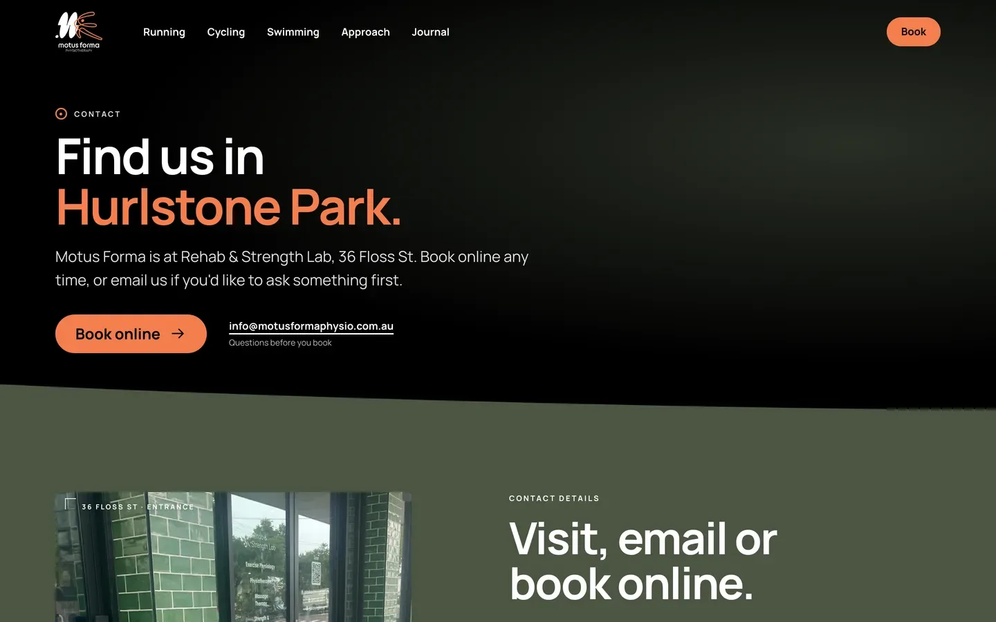
Then the first four pages.
Fees and booking, Running, About and Contact. Every Book button goes to the site’s own booking page, with his booking form built in.
Fees and booking
Contact
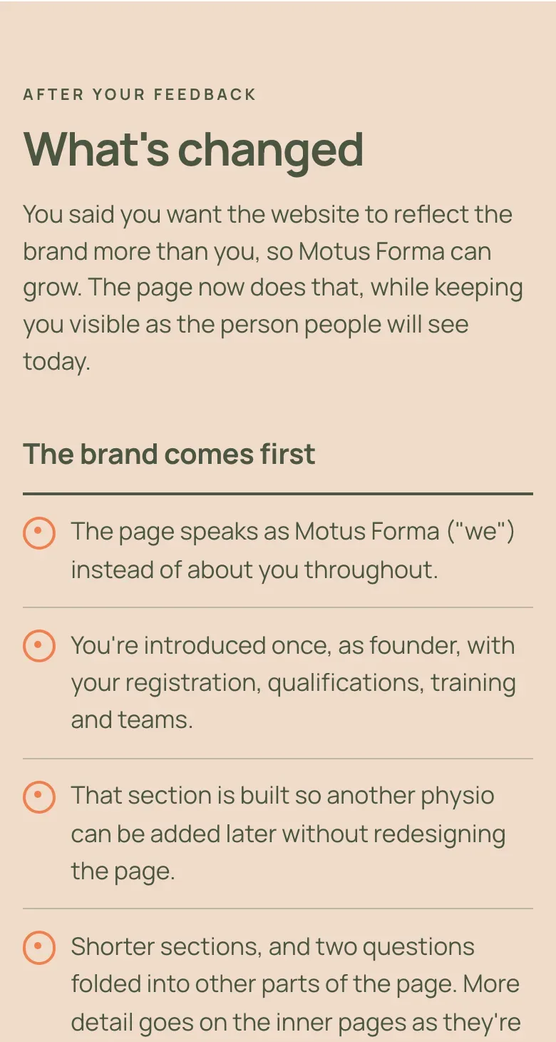
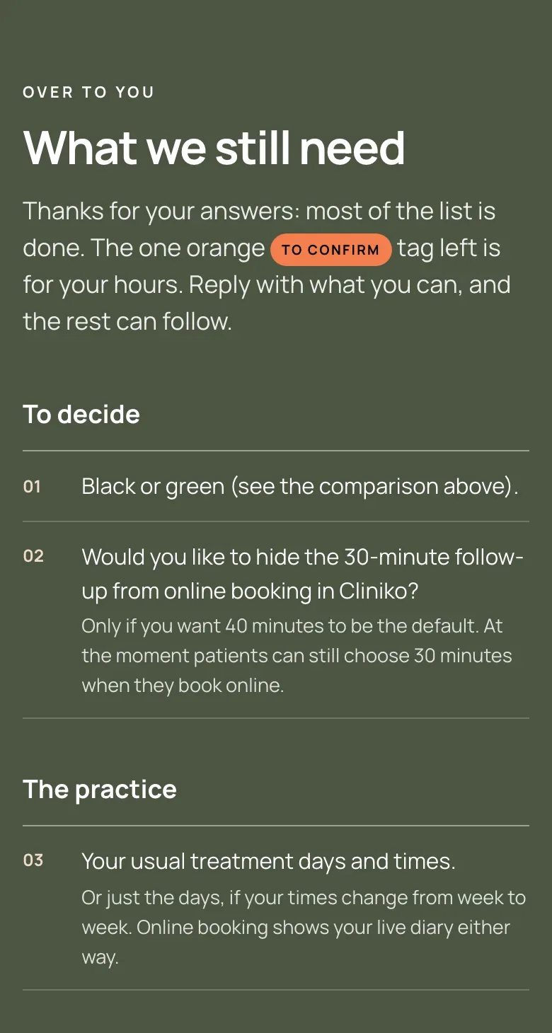
One page, always up to date.
What changed, what’s next, and what I need from him, in his own brand. By 13 November, it was on version 12.
What changed
What I need from him
Nothing goes live without his OK.
Every piece of feedback is written down as it was given, and every decision with who made it.
As at 13 November 2026
- His page
- Version 12
- Feedback
- 18 notes
- Decisions
- 31
Where it stands: the homepage and the first pages are built, and the site isn’t live yet.
In testing, the latest pages score 100 for performance on a phone.
How we could work together.
If you’d rather choose than be told, I show you the options side by side, each with its case, and you decide.
If you’re busy running the business, I keep one page up to date: what changed, what’s next, and what I need from you.
If you don’t like surprises, I write down every decision and who made it, and nothing goes live without your OK.